The Data Analysis Assistant in Subotiz displays analysis results as summaries, tables, or charts based on the returned data structure. Each format is designed to highlight specific aspects of the data for faster interpretation and decision-making. Charts are selected automatically by the system, and merchants can switch between available types within each result.
Viewing Result Formats
The assistant returns results in different formats depending on the type of data. Each format is designed to make the data easier to read and act on.
- Summary: A text-based conclusion generated from aggregated data. It appears at the top of most results and highlights the key insight in plain language.
- Table: A structured view of the data in rows and columns, used to compare values across dimensions such as country, product, or time period.
- Chart: A visual representation of the data that helps identify trends, compare values, and understand distribution patterns.
Interpreting Charts
The system automatically selects the most appropriate chart type based on the data returned. Different types of analysis use different default charts, but merchants can switch to another format if preferred.
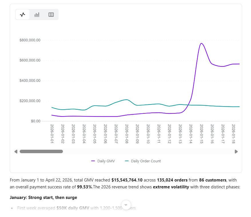
- Trend data: Shows how a metric changes over time, typically presented as a line chart. Can be switched to a bar chart or table.
- Comparison data: Compares differences between values, such as this month versus last month. Typically shown as a bar chart.
- Distribution data: Displays how data is spread across categories, such as transactions by country.
- Composition data: Shows how a total is divided into parts, such as revenue share by product. Typically presented as a pie chart.
- Detail data: Displays a flat list of records and is available as a table only.
Interacting with Charts
Charts are interactive and support several actions for deeper data review.
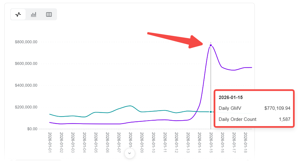
- Hover to inspect: Move the cursor over any data point to view the exact value. For comparison results, multiple values are shown simultaneously for quick comparison.
- Switch chart type: Use the chart type selector to change between available formats. Not all chart types are supported for every result.
- Expand to widescreen: Switch to widescreen mode for better visibility when viewing charts in a narrow panel. A toggle is available at the top right of the assistant panel, or use the expand option below the chart.
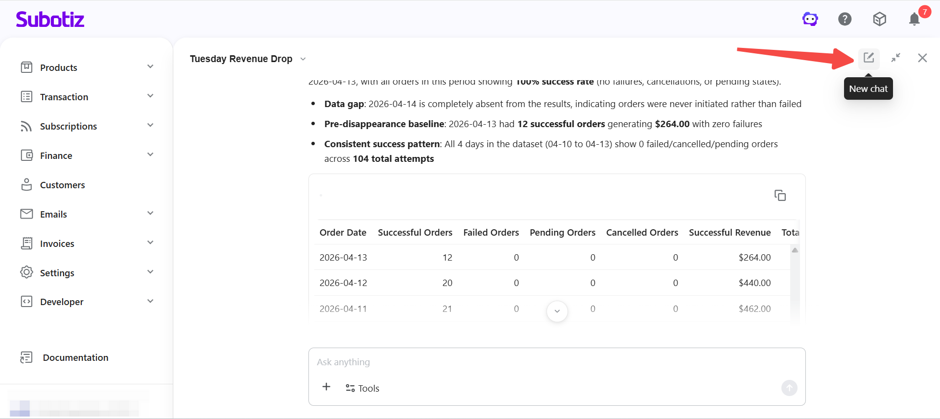
Working with Tables
Tables are used when data needs to be viewed in a structured format, or when no chart format is available for the result type.
- Review results: Scan aggregated data row by row to identify patterns or anomalies.
- Compare dimensions: Compare values across segments such as products or countries using rows and columns.
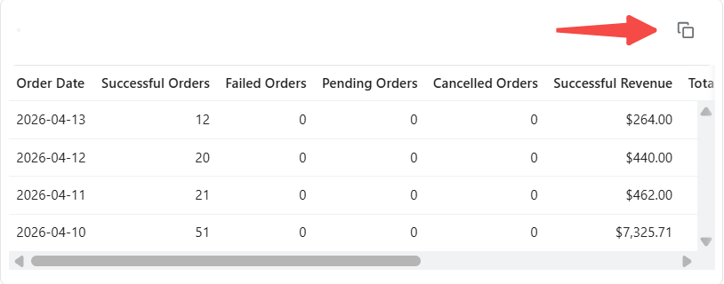
- Copy data: Copy the underlying data to the clipboard and paste it into external tools for further analysis.
Managing Analysis Sessions
Each analysis session retains context so merchants can build on previous results without starting over.
- Continue analysis: Ask follow-up questions to explore the current result in more detail. The assistant retains context and builds on previous queries.
- Start new session: Begin a new conversation to reset context when switching to a different analysis topic.
Limitations
- Chart availability: Available chart types depend on the returned data structure. Not all chart types are supported for every result.
- Table display: When data is not suitable for visualization, results are displayed as a table.
- Aggregated data only: Results are summaries and do not include individual transactions or customer-level data.
- Widescreen recommended: Charts may not display fully in narrow mode. Use widescreen mode for better visibility.
The Data Analysis Assistant automatically selects the most suitable format based on the data structure, with support for interactive charts and data export. Merchants can explore insights further through follow-up queries within the same session.